Bottom Navigation & Menu Builder
The Bottom Navigation Bar is the cornerstone of mobile user experience. Located conveniently within thumb’s reach, it grants instant one-tap access to your store or web app’s primary destinations (Home, Catalog, Cart, Account, Support).
WiXO features a powerful visual menu builder equipped with drag-and-drop ordering, rich icon picker, multilingual label translations, and an interactive real-time mobile simulator.
Navigation Builder Interface
Section titled “Navigation Builder Interface”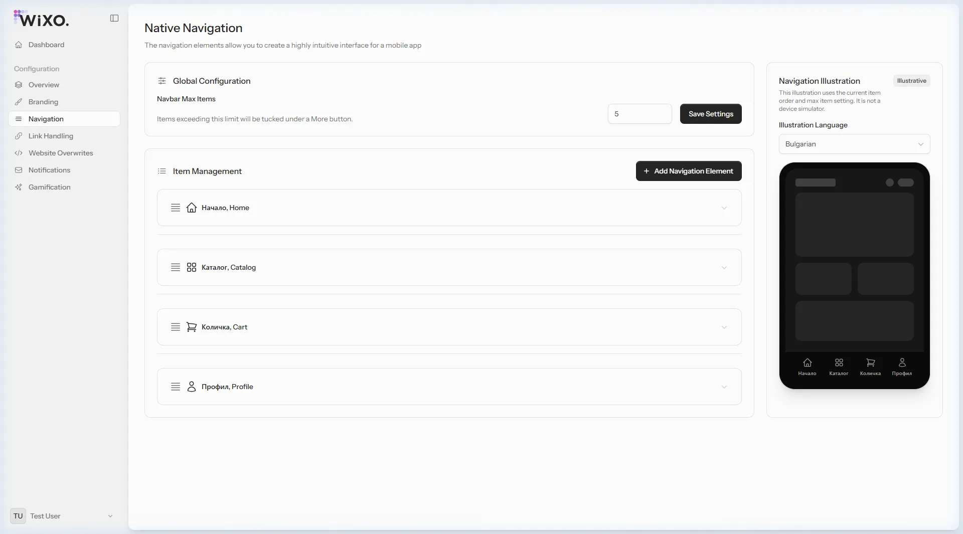
The navigation management screen is split into two complementary workspaces:
- Left Column: Global navbar capacity limits, interactive element listing, add element modal trigger, and item edit panels.
- Right Column: Interactive mobile phone mockup (Live Preview) that renders your configuration instantaneously across all configured storefront languages.
1. Global Configuration
Section titled “1. Global Configuration”At the top of the interface, the Global Configuration card governs the navbar’s overall layout behavior:
- Maximum Items (
navbar_max_items):- An integer between 1 and 8 (recommended: 4 or 5 on standard smartphone displays to prevent visual clutter).
- Dictates how many buttons render concurrently on the persistent bottom bar.
- Automated “More” Drawer Handling:
- When total active items exceed
navbar_max_items(for example, 7 items configured with a limit of 4), the first 4 items appear on the tab bar, and an automatic “More” button is generated in the 5th position. - Tapping “More” inside the mobile app triggers a slide-out drawer or overlay sheet displaying the remaining navigation links.
- When total active items exceed
- Unsaved Settings Badge:
- Modifying the maximum items input highlights an orange “Unsaved” badge until you click Save Settings.
2. The Four Navigation Element Types & Field Breakdown
Section titled “2. The Four Navigation Element Types & Field Breakdown”Clicking + Add navigation element launches a side flyout modal. WiXO provides 4 specialized element types:
┌────────────────────────────────────────────────────────┐│ Navigation Element Types │├─────────────┬─────────────┬─────────────┬──────────────┤│ URL │ JavaScript │ Email │ Telephone ││ (Web Link) │ (Script) │ (mailto:) │ (tel:) │└─────────────┴─────────────┴─────────────┴──────────────┘Type 1: URL (Web Address)
Section titled “Type 1: URL (Web Address)”The most common navigation element type. Loads an internal or external web page directly within the native in-app WebView container.
Configurable Fields & Controls:
Section titled “Configurable Fields & Controls:”- Icon Picker:
- Tap the icon button to open a modal with a comprehensive library of Heroicons and system icons.
- Search by keyword (e.g., home, cart, shopping-bag, user, heart, magnifying-glass).
- Refresh on Focus:
- A toggle switch exclusive to URL items.
- Operational logic: When enabled (
true), returning to or re-tapping this tab triggers an automatic page refresh from your web server. - Best practice: Strongly recommended for Shopping Cart and Account tabs so customers always see up-to-date cart counts, newly added items, and updated order statuses without manual pull-to-refresh.
- Multilingual Translations – dedicated tab per supported language:
- Label: The text rendered beneath the icon in the navigation bar (e.g.,
Home,Catalog,Cart). - URL (Action): The complete destination web address (e.g.,
https://trendstyle.bg/en/cart). Enforces strict URL syntax validation. - Description: Optional auxiliary text used for accessibility (Screen Readers) and rich menu descriptions in the “More” drawer.
- Label: The text rendered beneath the icon in the navigation bar (e.g.,
Type 2: JavaScript (Client-side Script)
Section titled “Type 2: JavaScript (Client-side Script)”Executes arbitrary JavaScript in the context of the currently rendered website without reloading or leaving the page.
Configurable Fields:
Section titled “Configurable Fields:”- Icon: Visual symbol representing the action (e.g., chat bubble, filter funnel, search icon).
- Translations:
- Label: Button title (e.g.,
Filters,Fast Cart,Live Chat). - JavaScript (Action): JavaScript statement or function invocation.
- Description: Optional clarifying comment or tooltip.
- Label: Button title (e.g.,
Practical Use Cases:
Section titled “Practical Use Cases:”- Slide-out Drawer Cart:
window.openSideCartModal();
- Trigger Mobile Product Filter Modal:
document.querySelector('.mobile-filter-drawer').classList.add('active');
- Live Support Chatbot (e.g., Tawk.to / Intercom / Zendesk):
Tawk_API.maximize();
- Native Browser Back Navigation:
window.history.back();
Type 3: Email
Section titled “Type 3: Email”Invokes the device’s native mail client (Apple Mail, Gmail, Outlook) pre-filled with the designated recipient using the standard mailto: protocol.
Configurable Fields:
Section titled “Configurable Fields:”- Icon: Envelope or mail inbox icon (
heroicon-o-envelope). - Translations:
- Label: E.g.,
Contact Us,Support,Feedback. - Email (Action): A validated email address (e.g.,
support@trendstyle.bg). - Description: Optional notice (e.g., “We reply within 24 hours”).
- Label: E.g.,
Benefits:
Section titled “Benefits:”- Eliminates clunky web contact forms.
- Lets customers send inquiries directly from their verified personal mailbox.
Type 4: Telephone
Section titled “Type 4: Telephone”Launches the phone’s native dialer with a pre-dialed number using the tel: protocol for instant one-tap customer calls.
Configurable Fields:
Section titled “Configurable Fields:”- Icon: Telephone receiver or handset (
heroicon-o-phone). - Translations:
- Label: E.g.,
Call Us,Order by Phone,Helpline. - Telephone (Action): Phone number formatted with international calling code (e.g.,
+359888123456). - Description: Optional operating hours note (e.g., “Mon - Fri: 9:00 AM - 6:00 PM”).
- Label: E.g.,
Comparison Summary Table
Section titled “Comparison Summary Table”| Element Type | Trigger Action | Dedicated Fields | Input Validation |
|---|---|---|---|
| URL | Loads page inside WebView | Refresh on Focus, URL Address |
Valid URL format |
| JavaScript | Runs JS snippet on active page | JavaScript Code |
Non-empty script |
Launches system mail client (mailto:) |
Email Address |
Valid email format | |
| Telephone | Dials phone number (tel:) |
Phone Number |
Valid phone string |
3. Organizing, Editing & Deleting Items
Section titled “3. Organizing, Editing & Deleting Items”Every configured item appears in the Item Management section as a collapsible accordion card:
- Drag-and-Drop Reordering:
- Grab the grab-handle icon (
bars-4) on the far left of any item card. - Drag the item up or down to your desired sequence.
- The new order is automatically saved via asynchronous livewire state and instantly reflected on the mobile simulator.
- Grab the grab-handle icon (
- Editing an Existing Element:
- Click anywhere on the item’s header to expand its complete editing form.
- Modify icons, multilingual titles, action values, or the
Refresh on Focusswitch. - Click Update to save changes.
- Deleting an Element:
- Click the red Remove button in the lower left corner of the expanded card.
- Confirm via the safety dialog: “Are you sure you want to remove this navigation element? This action cannot be reversed.”
4. Live Mobile Simulator (Live Preview)
Section titled “4. Live Mobile Simulator (Live Preview)”The sticky smartphone mockup in the right column gives you immediate visual assurance:
- Dynamic Column Grid: Automatically divides bottom space equally across active visible tabs.
- “More” Button Visualization: Displays the simulated “More” trigger if your item count exceeds the configured limit.
- Preview Language Switcher: A dropdown selector allowing you to preview how localized labels render in English vs. Bulgarian, ensuring text labels fit comfortably without unwanted ellipsis truncation.