Website Overwrites (CSS & JavaScript)
One of the most powerful features of WiXO is Website Overwrites. It allows you to tailor your website’s appearance inside the mobile app to deliver a 100% native look and feel, without altering a single line of your live website’s desktop code!
Overwrites Editor Screen
Section titled “Overwrites Editor Screen”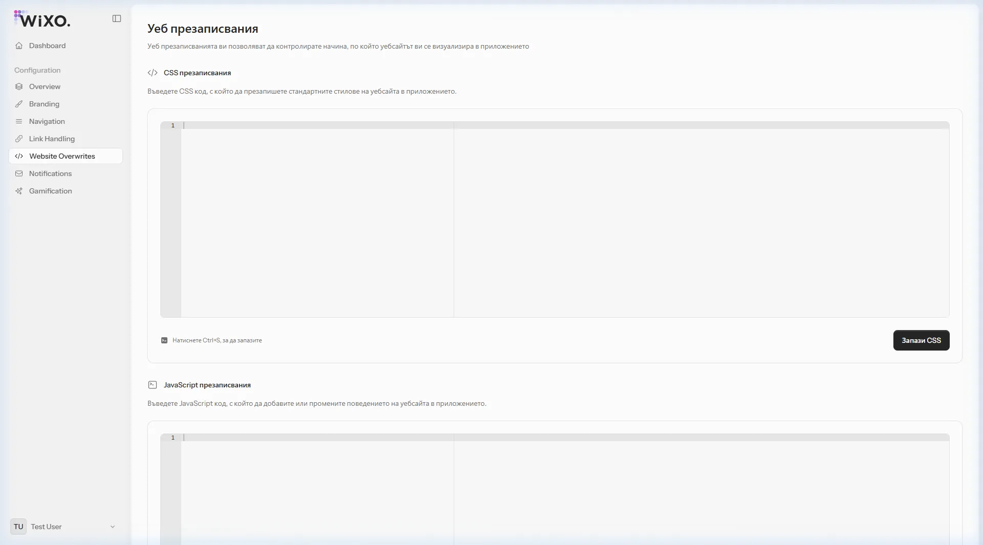
1. Why Hide Website Elements?
Section titled “1. Why Hide Website Elements?”When your website loads in standard desktop or mobile browsers, it displays:
- A top header with a hamburger menu (which duplicates the native bottom bar of WiXO).
- A footer containing long link lists, copyright disclaimers, and payment badges.
- Cookie policy banners, newsletter popups, or chat bubbles.
With WiXO’s CSS Overwrites, you can instantly hide these elements exclusively for mobile app users, keeping your standard web visitors unaffected!
2. Practical Recipe: Ready-to-use CSS Snippet
Section titled “2. Practical Recipe: Ready-to-use CSS Snippet”Here is a common, production-tested snippet you can paste into the CSS Overwrites editor:
/* 1. Hide the desktop header and hamburger toggle */header.site-header,.main-header,.mobile-header,.mobile-nav-toggle {    display: none !important;}
/* 2. Hide footers and copyright disclaimers */footer.site-footer,.footer-widgets,.copyright-bar {    display: none !important;}
/* 3. Hide cookie consent popups (the native app manages consent) */#cookie-notice,.cookie-banner,.cc-window {    display: none !important;}
/* 4. Remove unnecessary top whitespace */body { padding-top: 0 !important; margin-top: 0 !important;}3. Custom JavaScript Overwrites
Section titled “3. Custom JavaScript Overwrites”In the JavaScript Overwrites console, you can run custom scripts across every page transition in the app:
- Listen to checkout events.
- Close specific overlay modals upon page entry.
- Fire specialized app tracking hooks.
Saving Your Changes
Section titled “Saving Your Changes”- Paste or edit your CSS or JavaScript code in the respective editor window.
- Click Save CSS (or press
Ctrl + S). - Your updated stylesheet is cached and applied instantly on the user’s next mobile screen reload.